In 2019, air pollution caused 4.2 million premature deaths worldwide, World Health Organisation’s data show.
Across Europe, citizen science initiatives help to tackle this issue and are cities’ allies in improving the air we breathe.
The power of visualising citizen science
“You should visit areas with cleaner air today.” This is the warning that pops up on the hackAIR website as the mouse hovers over a neighbourhood in Warsaw.
hackAIR is an easy-to-use platform visualising air pollution in cities and one of the 40 initiatives of CitiAIR. This latter is an inventory that aims to facilitate the exchange of information on air quality across Europe. It was established under CitiMeasure, an EU-funded project bringing together expertise in promoting and implementing citizen science.
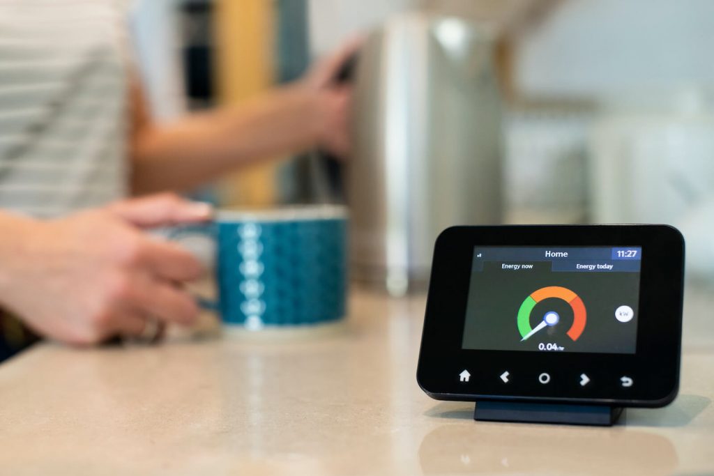
Local governments cannot install gauging stations everywhere in the city, but citizens can supply that missing information by measuring air quality in areas where stations aren’t available. Initiatives like the hackAIR contribute to this effort by encouraging users to participate in air quality monitoring, using low-cost open sensors and by providing an abundance of real-time data.

The hackAIR map to monitor air quaity in Europe
The HackAIR platform features an interactive worldwide map combining data from official air quality stations, citizens’ figures, and users’ air quality perceptions.
What data teaches about air quality
A map is but one of the many existing tools that allow to report on air quality. Charts, graphs, or tables are other popular methods to showcase the results of citizen science initiatives. Most of these tools are platforms relying on open data, something crucial to creating a more inclusive science: by making data available to everyone, open data helps to bridge the gap between professionals and citizens.
Also, past data can be as important as new one as it allows to compare and discern trends, such as whether the air quality is improving in a certain area of the city.
What maps show
More than two thirds of CitiAIR members use maps to visualise their data. For good reasons: space is complicated, and maps bring clarity.
But locations alone do not tell complete stories – in many cases, they reveal little of residents’ social and cultural realities. Without interpretation and background information, maps can offer an erroneous picture.

Graffiti of a person in a gas mask
In addition to the geographical visualisation of data, many CitiAIR partners rely on other tools. For example, Les Chercheurs d’Air – a Brussels-based initiative – uses graphs showing the average NO2 concentration in the city compared to acceptable levels. This with much success: visualising daily exposure has helped strengthen the initiative’s demands.
ClairCity, a project piloted across Europe, specialises in data visualisation at the individual level. In an app, users can view their particular activity, personal air pollution exposure, and generated emissions based on their choice of transport. The expectation is that these daily graphical confrontations would make behavioural change more likely.
The way forward
CitiAIR members share an enthusiasm for cleaner, smarter, and more inclusive cities. Data visualisation can help bring people on board for this mission. It can improve people’s understanding of their immediate surroundings, offer a powerful argument for policy change, and create a sense of personal responsibility.
Fresh approaches to data management can also make a difference. Increasing public access to data is a step in the right direction. Yet the mere publication of data is not enough. For everyone to have equal access, digital competencies across society must be strengthened.
Despite its demonstrated benefits, citizen science is still met with scepticism. Many decision-makers shy away from making it an integral part of government planning. Without residents’ input, however, a better urban future is unlikely. New and innovative graphic tools could offer the answer to draw attention to and help mainstream citizen science.
CitiMeasure uses citizen measurements to create smart, sustainable, and inclusive cities. Do you want to contribute?
Add your citizen science initiate to CitiAIR. You can share your story here.